
from exposé to independent brand
The evolution of the corporate design creates a distinctive, emotionally resonant brand identity that appeals to the target audience of young families.

client
VISTA is a brand of the Dornieden Group, one of the region’s most experienced real estate developers. While the established umbrella brand stands for exclusivity and groundedness, VISTA aims to reach a different audience: young people looking to fulfill the dream of homeownership – a target group with its own wishes, values, and a clear vision of what a home should feel like.
task
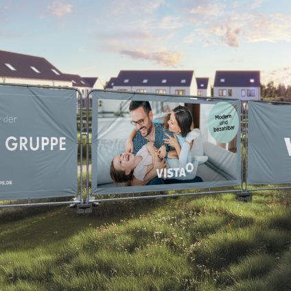
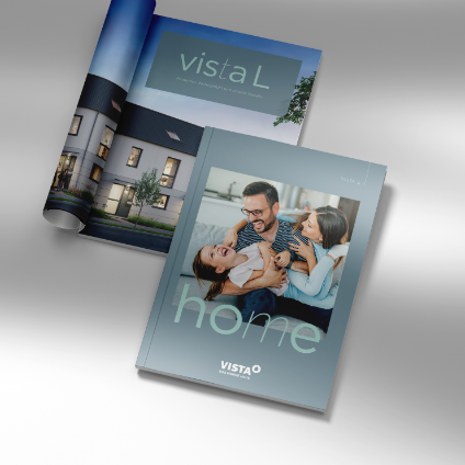
While we initially discussed redesigning a sales brochure, our dialogue with VISTA quickly revealed that a fresh layout alone wouldn't truly do the brand justice. The existing corporate design bore the unmistakable stamp of the umbrella brand; consequently, the look was too matter-of-fact and straightforward for VISTA’s target audience. The time had come to evolve the corporate design and establish a distinct identity. The brochure thus became the cornerstone of a new brand identity, implementing a design system capable of supporting VISTA for the long term.
systematic standardization
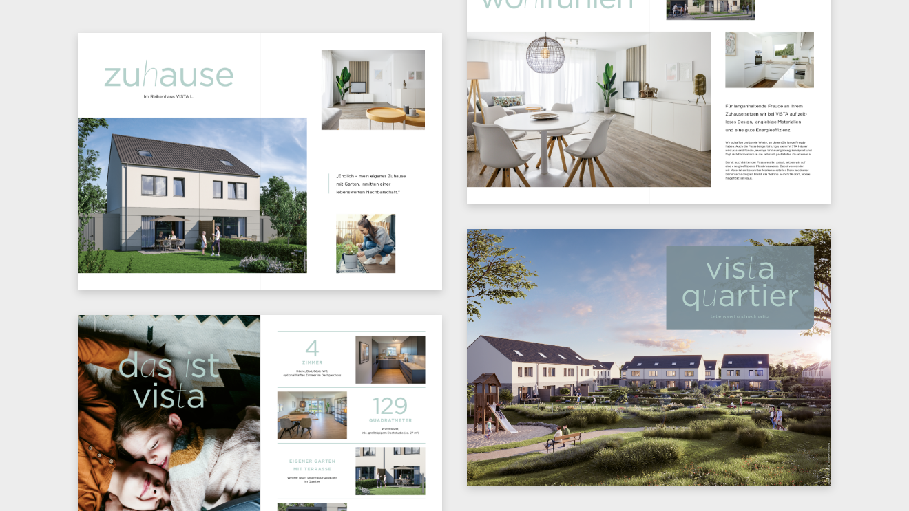
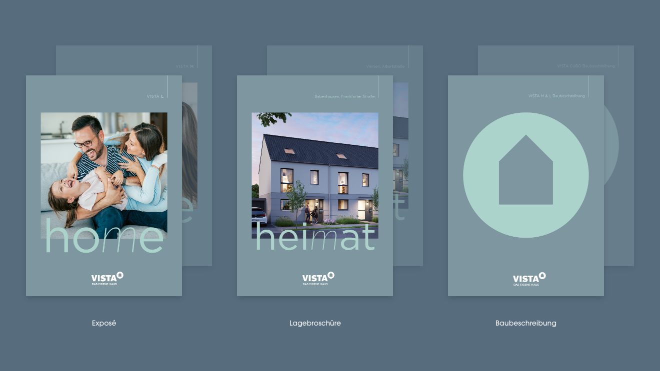
The aim was never to completely reinvent VISTA. Instead, the corporate design was carefully evolved, incorporating visual links to the umbrella brand. At the same time, we gave VISTA a distinct voice and developed a corporate design that creates an emotional connection with the brand’s target audience. The goal was a flexible design system capable of growing alongside the brand. From the initial concept presentation to location brochures, building specifications, and other assets, the resulting corporate design is both versatile and consistent.
evolution aligned with the target audience
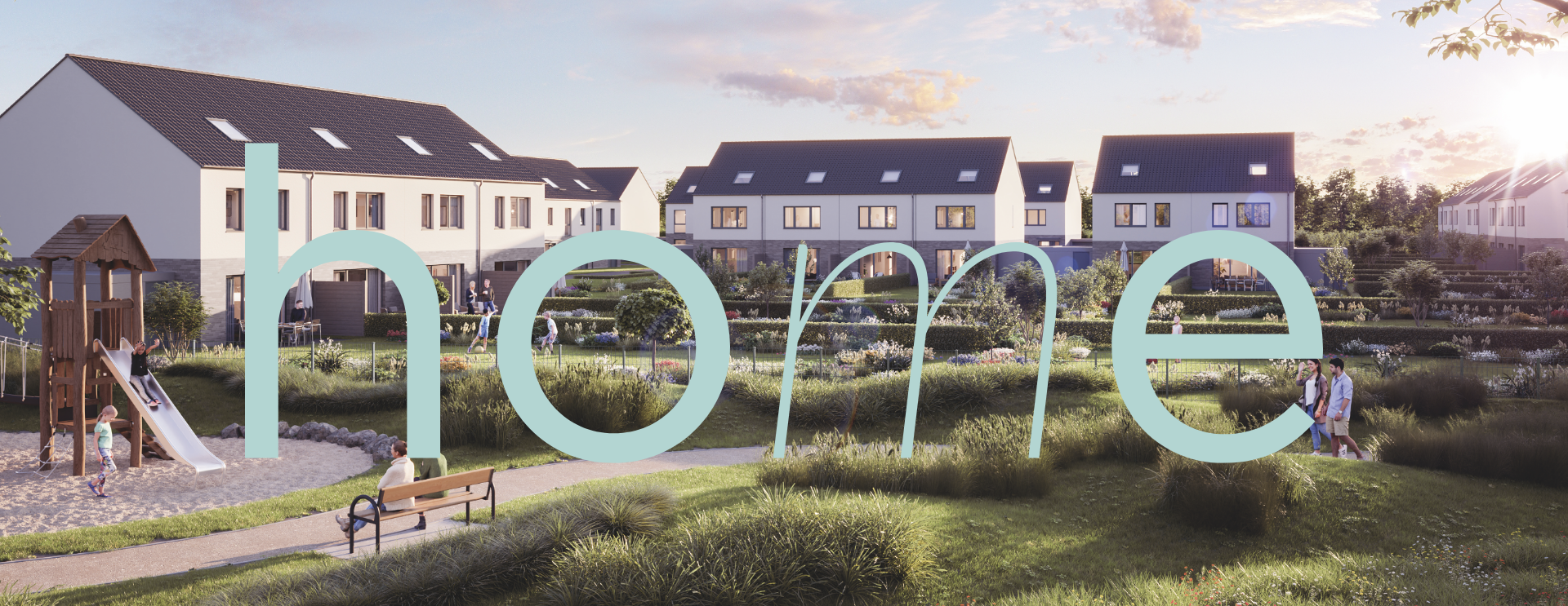
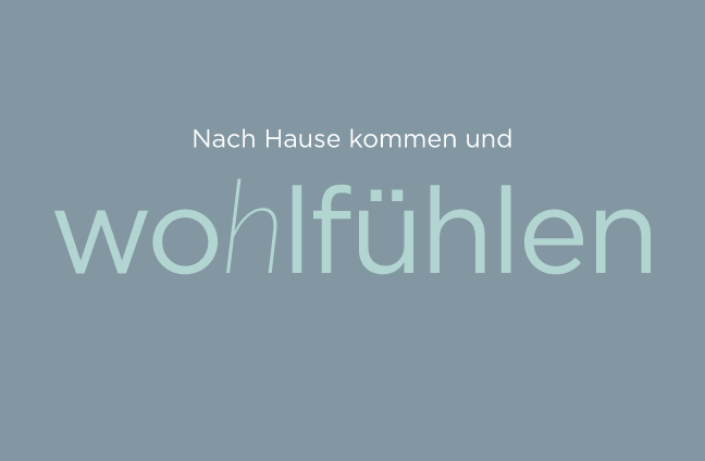
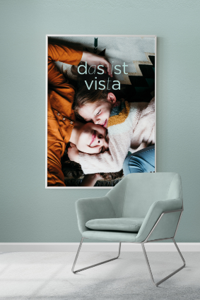
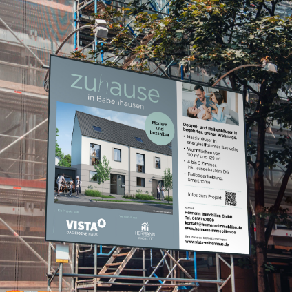
VISTA’s new corporate design trades rigidity for a sense of lightness. It offers a preview of the lifestyle a VISTA home promises – featuring playful typography, illustrative elements, and a design that radiates joy. It is tailored to a target audience that is not merely looking for a home of their own, but also wants to see themselves reflected in the brand. VISTA delivers exactly that: the feeling of “arriving home” right from the very first interaction.
bright and welcoming
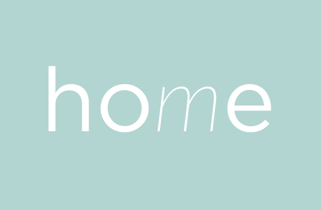
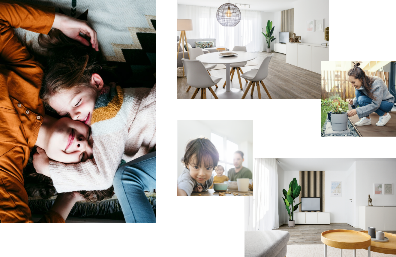
The corporate design update has also introduced a new color palette: bright, open, and inviting. The new color scheme relies on friendly, clear tones that feel contemporary without appearing overly sterile. Generous use of white space creates a sense of lightness, while strategic accent colors provide visual guidance. Throughout this process, the focus remains on the target audience, who value a fresh, lively, and distinctive approach.


a real feeling of home
Real-life moments: young couples, small children, and scenes full of movement. Whether it’s breakfast together, romping around the living room, or relaxing in the garden – these images don’t tell glossy, staged stories, but capture everyday moments. That is exactly what a VISTA terraced house promises: not a show home, but a real home.
With the corporate design refresh, VISTA has found its own emotional voice – perfectly tailored to our target audience and flexible enough to grow with us.Judith Uttenweiler, Head of Marketing at DORNIEDEN Gruppe GmbH & Co. KG
more projects

Awarded attention for an important topic
We were honored with the German Design Award 2025 for our attention-grabbing campaign ‘take a closer look when it counts’.
to project

you are here. you are also awesome.
Call us without obligation or get in touch by email. By the way: We don't have projects that are too small or too big. Only important ones.

