
Corporate design refresh for a premium brand
Redefining premium quality. With a corporate design refresh for one of the region’s most experienced real estate brands.

client
The DORNIEDEN Group is a family-run company with over 110 years of experience in the real estate industry. Whether it is a dream apartment in an urban setting, an elegant city villa, or a high-quality townhouse – with award-winning architecture, well-conceived floor plans, and features that leave nothing to be desired, the umbrella brand caters to a target audience looking to realize their dreams of high-quality living.
task
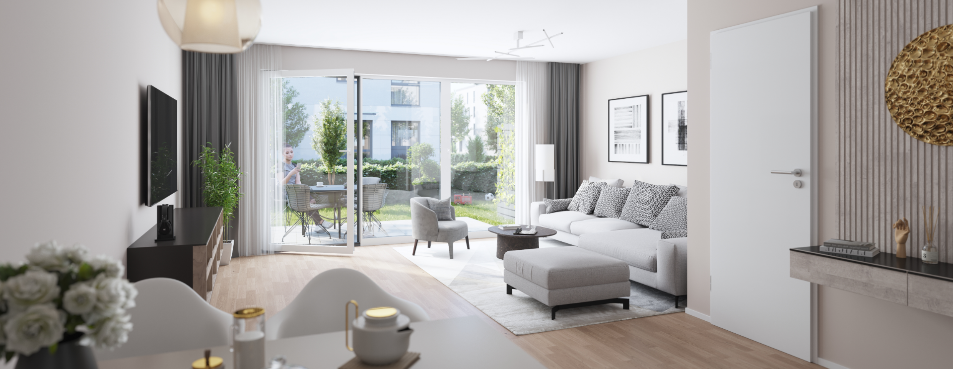
The DORNIEDEN Group’s original corporate design was functional and rock-solid. However, with its highly linear and technical aesthetic, it primarily appealed to the target audience’s rational side. It soon became clear that there was untapped potential here: people who desire a DORNIEDEN home dream of more than just square footage and lists of specifications – they dream of a life where they can leave the daily grind behind at the end of the day. The new corporate design aims to convey precisely this, without sacrificing the professionalism and reliability for which the brand stands.
systematic standardization
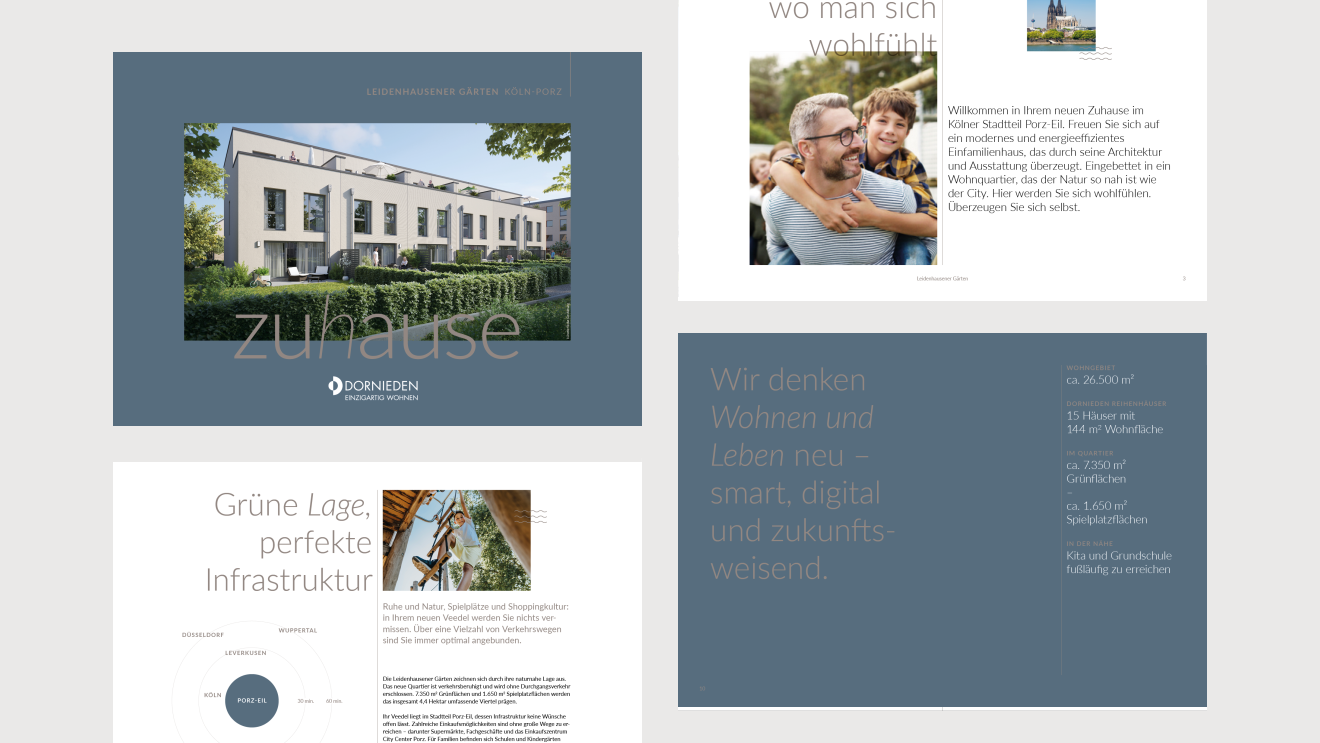
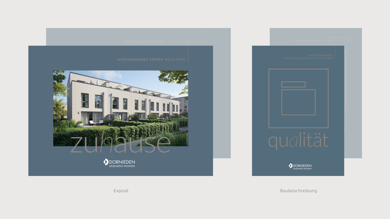
The goal was not a complete redesign, but rather the targeted evolution of existing assets. The aim was to strengthen the brand core and make the approach to customers more emotional. The result is a design system that works across all touchpoints – from brochures and site documentation to construction specifications – offering consistency while remaining flexible enough to adapt to the specific point of contact with the target audience.
evolution aligned with the target audience
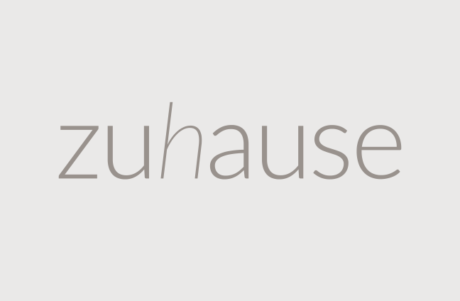
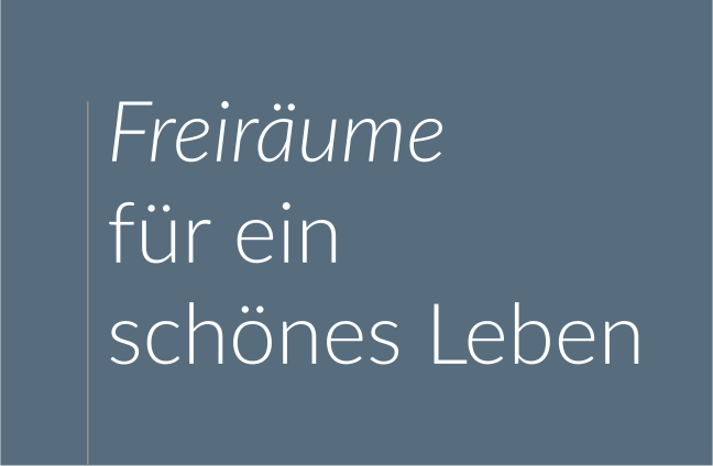
Moving away from cool, matter-of-fact objectivity toward a design language that makes the premium quality tangible. The DORNIEDEN Group’s new corporate design is calm and confident: featuring clean typography, high-quality imagery, and a refined, clear color palette. This creates a brand presence that befits the exclusivity of the projects without appearing aloof.
high-quality and timeless
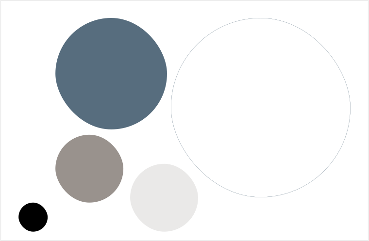
A color palette that promises exclusivity without appearing ostentatious. This has been achieved through a skillful blend of sophisticated, muted tones and the strategic use of bronze accents. These accents exude a touch of elegance, while modern teal shades convey a sense of quality without feeling dated. Consideration was also given to the subsidiary brand VISTA – part of the DORNIEDEN Group – which targets a different demographic. While both brands reflect their shared lineage through their corporate design, they differ in how they address customers, a distinction that is also mirrored in their respective color palettes.
show real life
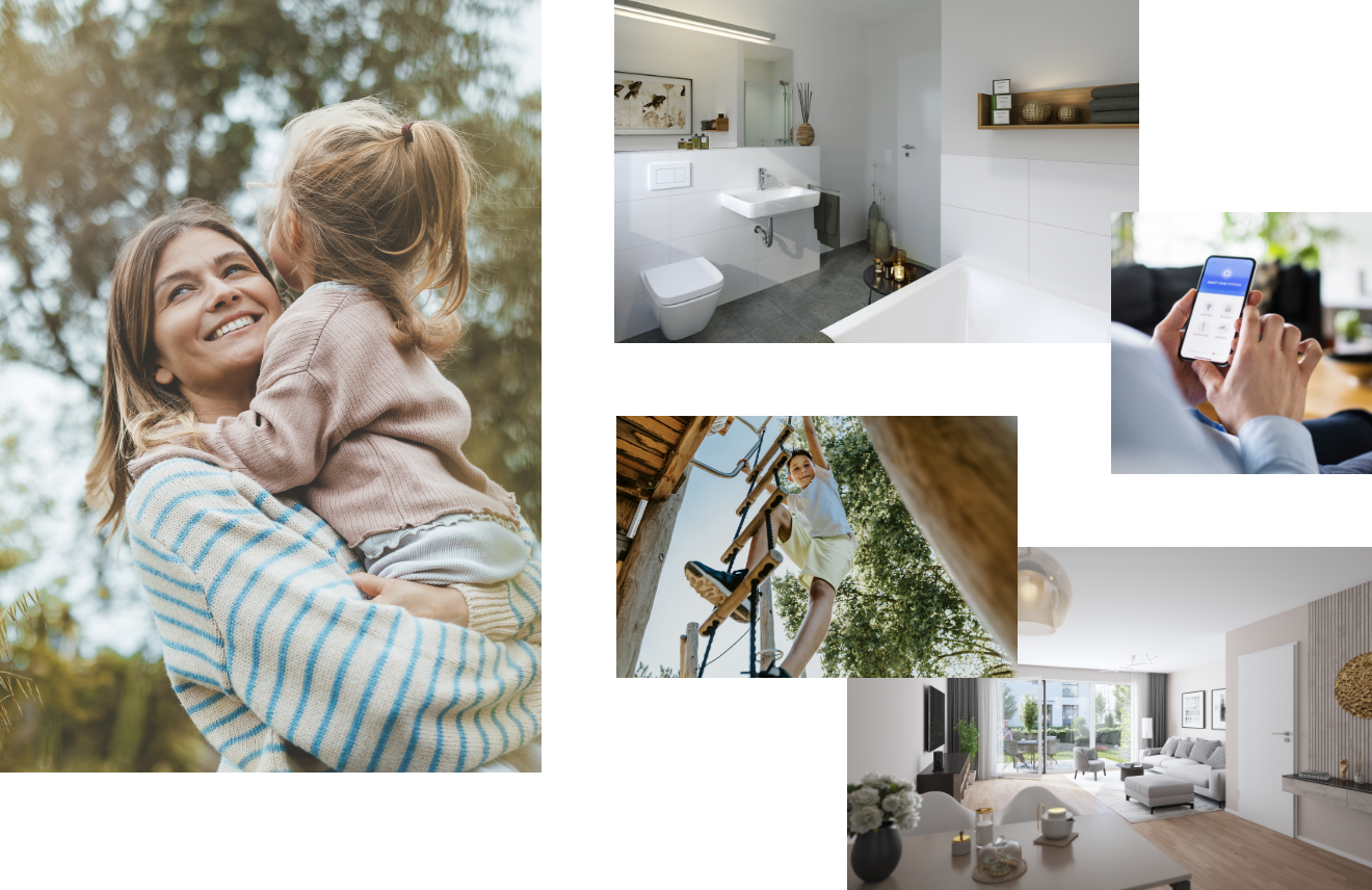
The visual style has also been evolved – moving away from overly technical depictions and towards real life. The goal is an authentic visual world that captures glimpses of people’s everyday lives. It evokes a desire for what DORNIEDEN stands for: escaping the daily grind within one’s own four walls and enjoying a sense of exclusivity.
additional media
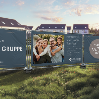
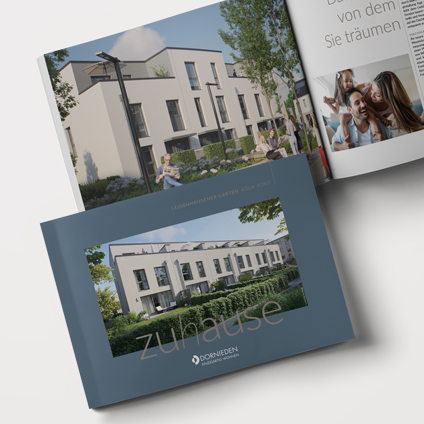
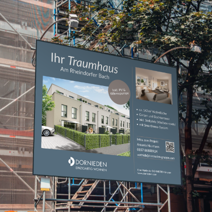
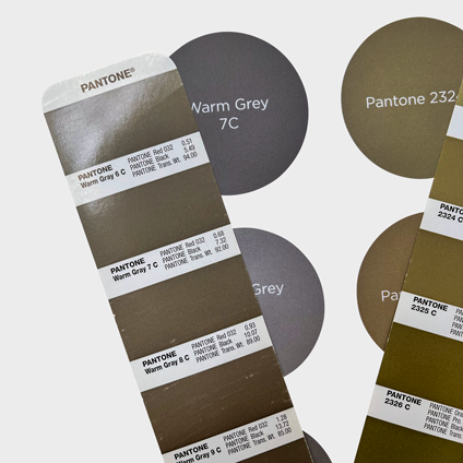
The new corporate design strikes exactly the right note: a sophisticated yet approachable sense of home. It reflects what we have stood for for over 110 years while simultaneously showing where we are headed.Judith Uttenweiler, Head of Marketing at DORNIEDEN Gruppe GmbH & Co. KG
more projects

Awarded attention for an important topic
We were honored with the German Design Award 2025 for our attention-grabbing campaign ‘take a closer look when it counts’.
to project
you are here. you are also awesome.
Call us without obligation or get in touch by email. By the way: We don't have projects that are too small or too big. Only important ones.

